To make your bright areas more intense make your darks darker.
I did the painting on the left first, it really did not look too bad. The Sunset at Otter Crest was quite dramatic so I wanted it to “pop”. I darkened the rocks and even the distant, dark, part of the ocean, as well as the lower clouds a bit – the difference is pretty clear. I did nothing to the orange and yellow areas. Procreate makes this kind of thing so easy, but it is not too hard to do with watercolor, just a dark wash over the first would work just as well.


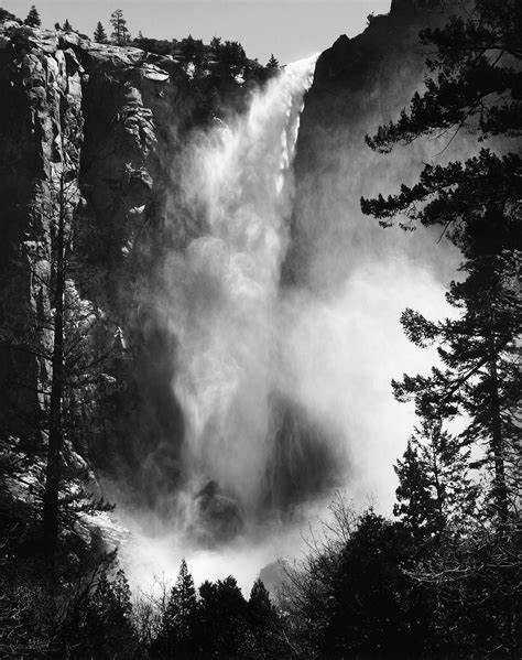
Ansel Adams was famous for his dramatic photos of Yosemite National Park. One of his trademarks was to darken the darks when he printed the photo, note how the dark contrast of the rocks and the foreground trees makes the waterfall stand out so dramatically.

I always struggle with this one (in spite of the silhouette work!)
LikeLike
Me too, was always afraid of making it too dark, still struggle with it. So glad you commented, looking forward to following you as well.
LikeLike