The last couple of weeks I gave some tips for sketching buildings, and used a couple of different approaches. This is all to show that there is not just one way to sketch a building while traveling. Today I continue that concept with an even different approach. I am using my “local” place, The Fields Bar and Grill for the sketch.
This week I am responding to the frustration some have with sketching buildings by using 5.9mm graphite to build a foundation of shapes, while avoiding over analysis and too much detail.
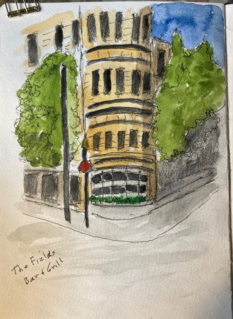
Let me show you how I did it. Now just a reminder that our goal is to capture the moment, not necessarily produce a “finished” work of art – whatever that is.
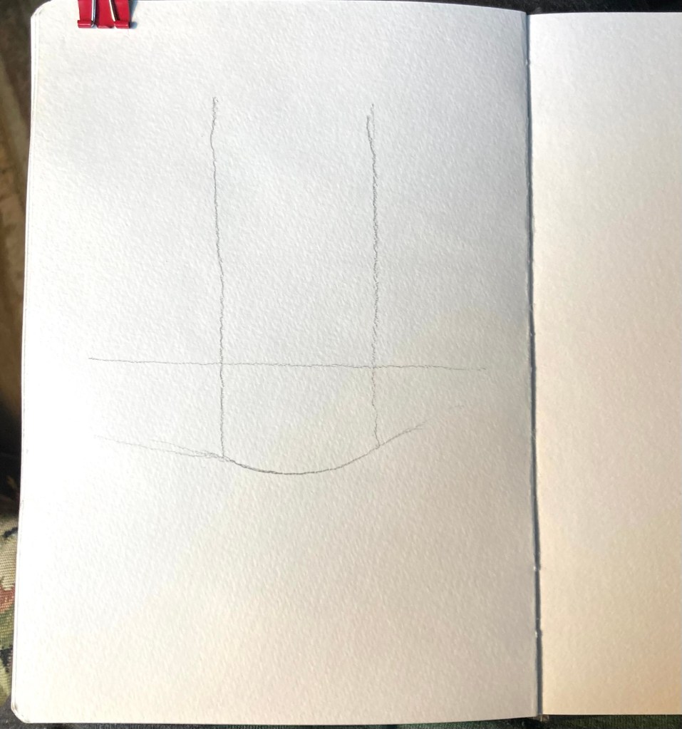
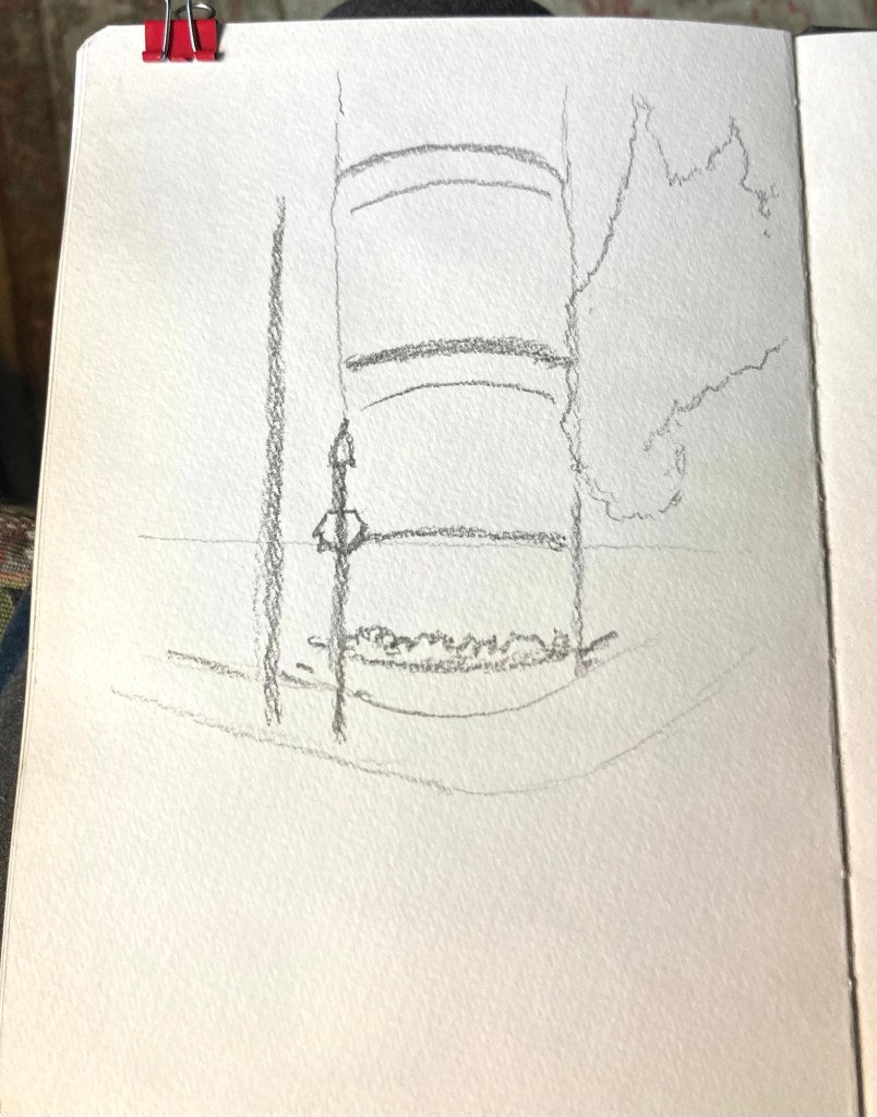
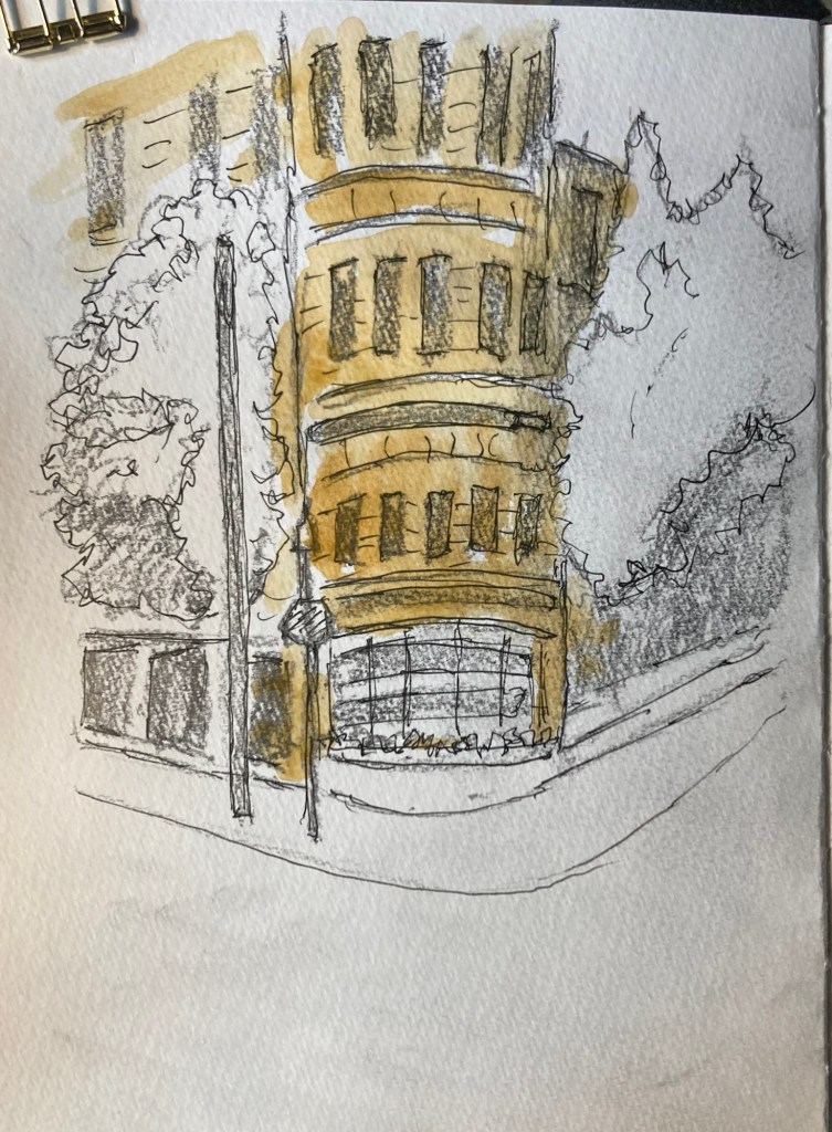
As I have done the last few weeks I began with a couple of lines to block in the major shape of the restaurant’s facade. The horizontal line shows eye level.
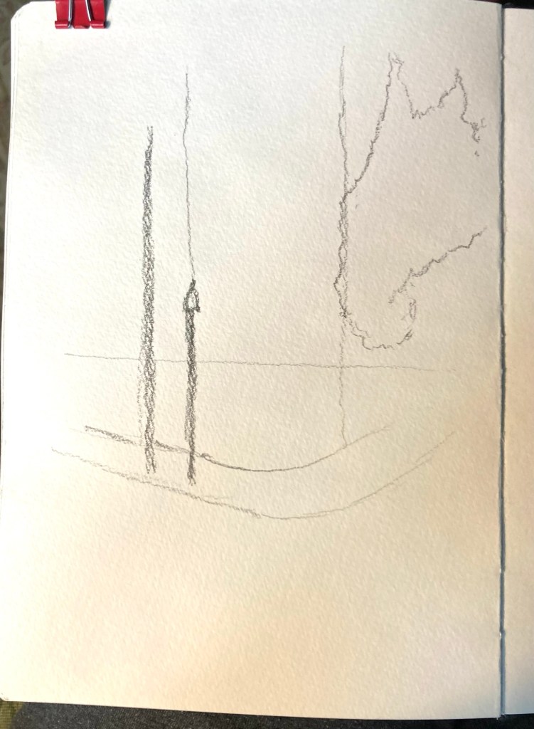
I often find that working from front to back, at least a little, helps keep it from ending up flat, so I added the two light poles, and the large tree shape on the right, note that there is little detail, we are pretty much blocking in what you would see if your squinted.
Next came the curved lines indicating the sections, the floors, of the building. I was pretty loose and did not waste much effort on precise measurements, this is not an architectural drawing at all. Note that the lines above the horizon curve downward, those below curve up. And the higher lines have a bit more curve, but please, don’t worry too much about getting it precise. I also added a light indication of the sidewalk.
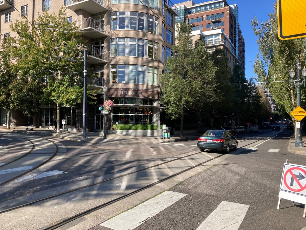
I started blocking in the window areas, added a squiggle that might be plants. The photo shows decks to the left of The Fields that I just did not want to bother with, so when I added the foliage of the tree on the left side I took some artistic licence and made it go a bit wider.
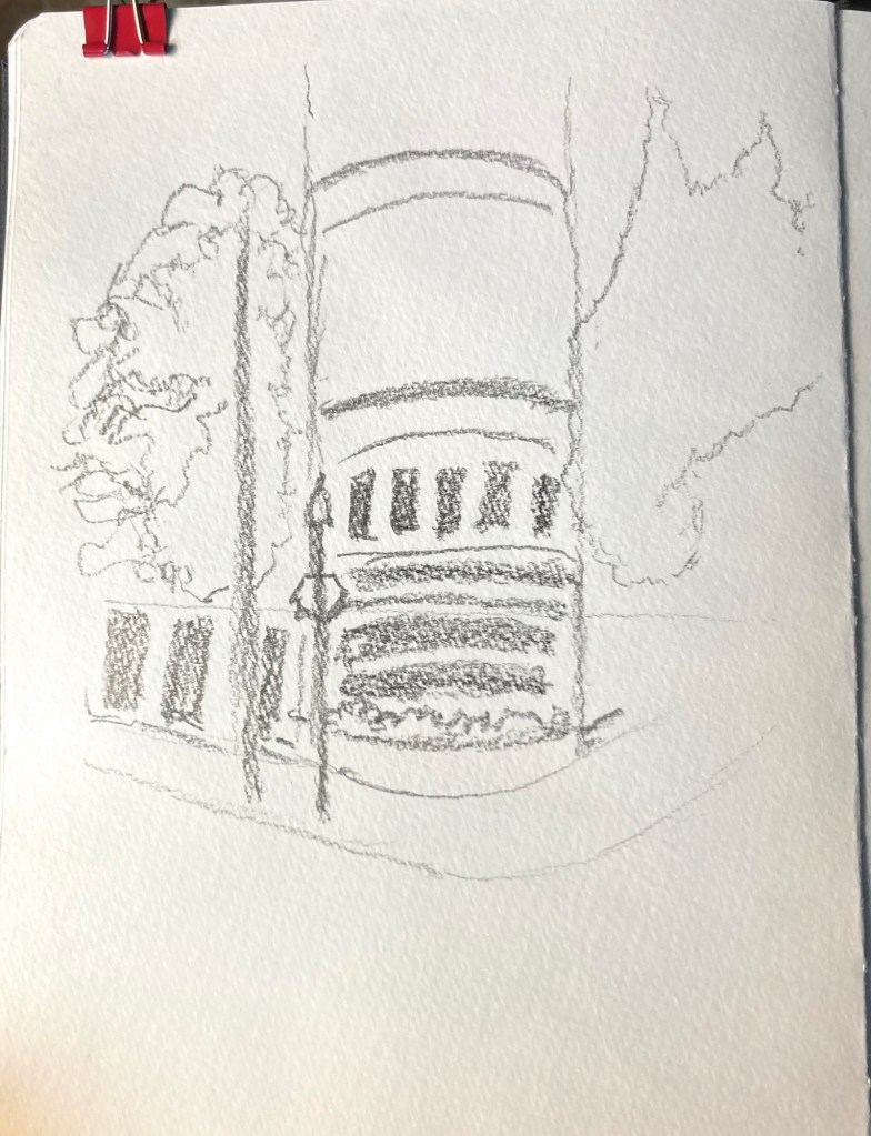
After finishing with the windows on the curved part of the building, and it is OK that I ended up with five windows instead of the six, who other than me will ever know and or check. I also indicated the roof line going down the street to the right along with a window
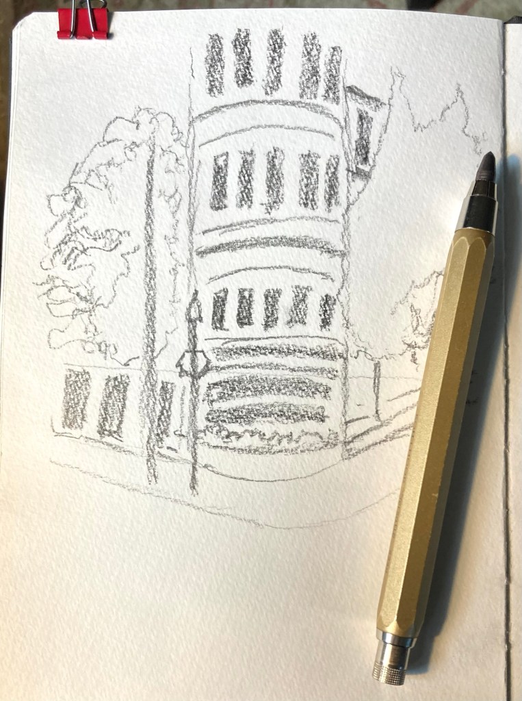
I finished up the graphite part of this by adding some windows at ground level and upper story of the building on the left. Both of the trees have dark shadows, as well as the area under the tree on the right. I also added a bit of shading on the right side of the curved part of the building which adds to its curved look.
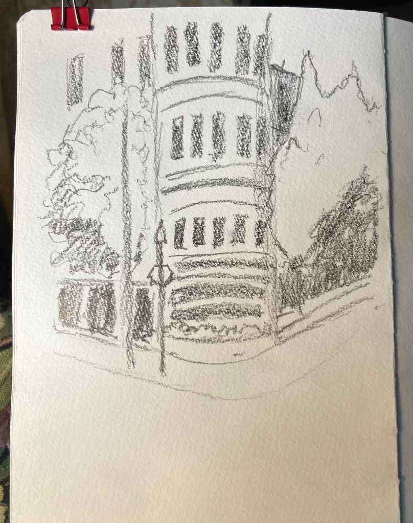
If time had been an issue I could easily have stopped there and called finished, the graphite sketch captures the essence of the place quite well. But a little watercolor will add a lot to it. In addition graphite will smudge, and even a light wash of watercolor stops that.
Yellow Ocher is a good all around base color for so many buildings. In this situation I did not fuss it’s any mixing, just diluted it a bit a painted, right over the windows.
I also used waterproof ink to make the curves a bit sharper, and add some detail to the ground floor. This could be done before or after the paint, as long as you allow for drying between the two.
Next I used Sap Green for the trees, notice how no extra color mixing was needed on the tree on the left to show the darker parts, the graphite under the paint did the work. I added gray to the dark areas to the right and left, and a light gray on the street level windows. Just this bit of color is making it look quite good.
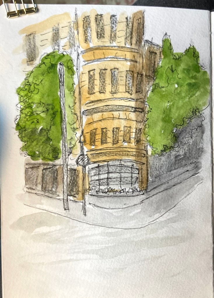
Lastly I did a couple of tricks that always help. Notice how the bright blue of the sky makes everything pop. I added a bit of bright green for the plants in the foreground, and bright red for the stop sign. Many great artist used at least a small amount of red someplace in their painting, it does wonders.
I realized it needed something more – contrast. So I went over the windows with Payne’s Gray, though any dark gray or even black would work. Also I darkened the light poles which made them move to the front, creating depth.

Be sure to label what you sketch in your sketchbook, and the date, as you will be glad you did when you look back in the future.
The essence of this demo was to show how to use graphite to block out the main shapes, without getting bogged down with detail. Then using a bit of color to preserve the graphite, and add more interest to the sketch.
I hope this I motivates you to give it a try, let me know how it works or if you have any questions.

It is so fascinating to see how you build up the images. I remember many years ago going to an exhibition of drawings and works by Tove Jansson of the Moomins fame, and how she created some of the scenes, building up, layer upon layer, even cutting and pasting odd bits together. I went with an artist friend who explained all sorts of things to me which made it even more interesting.
LikeLiked by 1 person
Thank you, thinking in layers is a basic way of approaching things. Thanks as always for following.
LikeLike
This is such incredibly thoughtful and helpful brass tacks advice. And you final sketch is wonderful. The combination of graphite and ocher make it look so rich and layered. Great post.
LikeLiked by 1 person