Just one year ago next month we moved to France, after 35 years of living in the Seattle, Washington area. What a difference a year makes.
Seattle Metro has a population of 4,102,400 according to the 2022 census, it regularly ranks in the top ten worst traffic cities and in the top ten most expensive places to live in the USA. Tricia commuted to downtown Seattle from our condo in Mukilteo, with no traffic a 20-25 minute drive, yet on most days it took 60-90 minutes each way. We were ready for a change.
Change we did. When Tricia retired we moved to Quincaillerie, La Thebauderie near Torchamp, the district of Orne, Normandie (the houses here have names not street numbers). Here is a Google Maps Satellite view of where we live now.

The two building complexes near us are dairy farms, everything else is pasture. The closest village, Ceaucé, is 3 miles away. If we pass three cars on the way to Ceaucé we joke about how bad the traffic is. Our life slowed to a crawl. We quite enjoyed the slow pace, for a bit. Yet the longer I live in Normandie, the more I love and would like to live in Paris.
Impressive art has a number of critical components, none more important than the contrast between dark and light spaces. For many years dark and bold colors intimidated me. Growing up with little confidence in my ability as an artist I froze when a scene called for almost black shadows, or strong bright red. Possibly that was what attracted me to watercolor as it was so easy to lighten up colors, use dark gray instead of black. Sadly it also made my art look hesitant at times.
To all of the folks using watercolor boldly, like Mark Holmes and Gabe, I know that watercolor can be bold, but for me it gave my hesitancy a refuge.
From time to time I analyze my posts on Instagram to see which sketches get the strongest responses. Time and again the posts that have the boldest colors and darkest darks produce the best responses. I don’t do art to get “likes” but they are a bit of an indication as to what people notice.
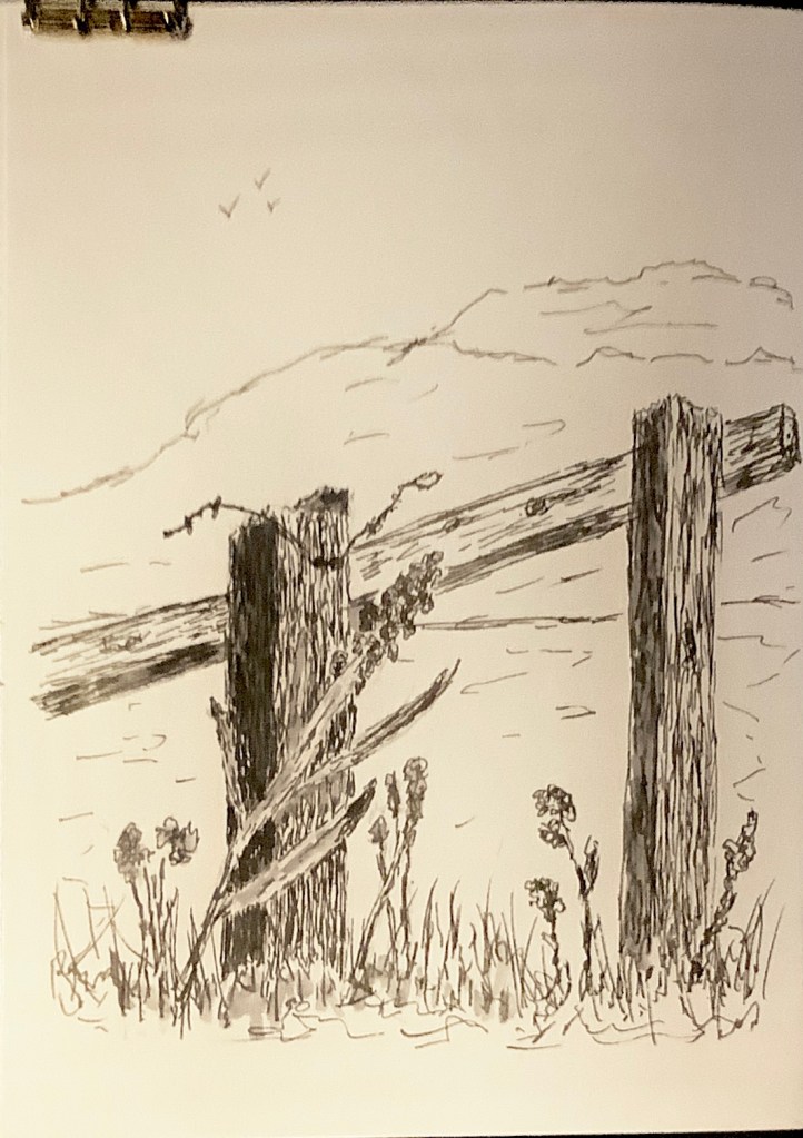
These last few months I have drifted back to my early love of pen and ink, darkening the darks more than I ever dared in my early days. Here are a few from this week.

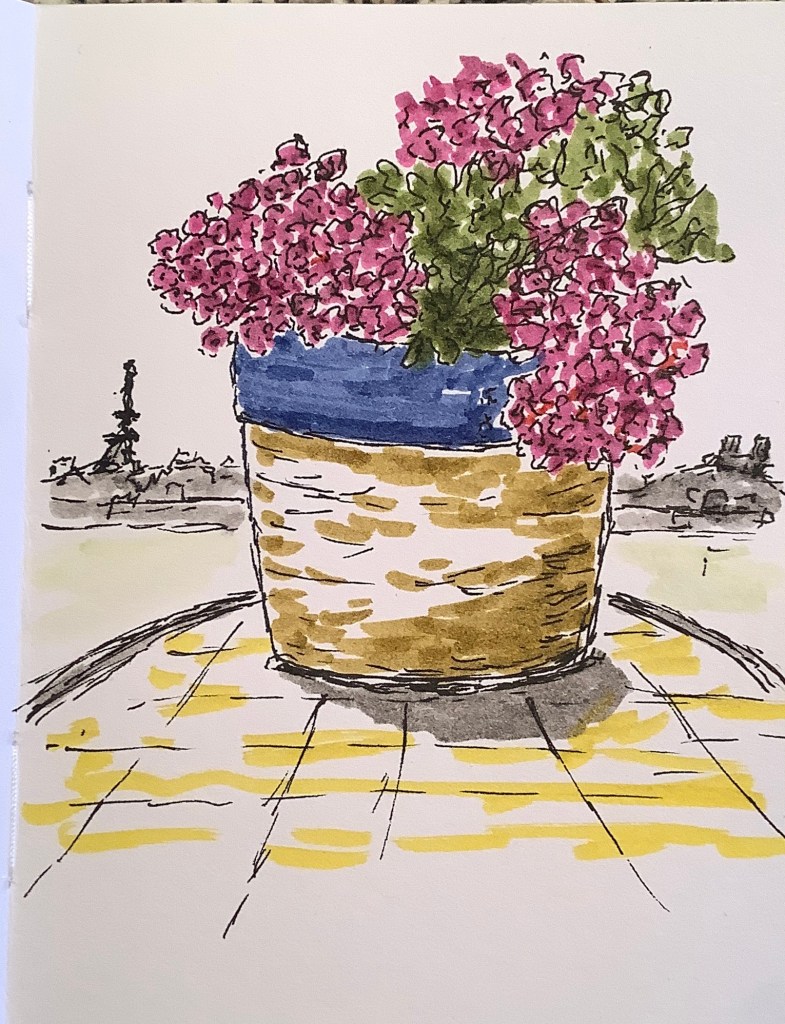
This week I sketched using my Faber Castel markers at full strength. I quite like the results.

Living in a rural community of seven ancient homes, where everyone but us speaks UK English, is a safe, quiet, light-watercolor type of living in France. We can go days without ever speaking any French to anyone, it is safe and without much risk. It is like a thin wash of watercolor.

Paris is bold, it is more intense, more dynamic, and more interesting. Normandie is becoming a bit boring, I think that is why we travel a lot, to spice things up. Paris is a painting done in bold colors and dark darks. We are finding that we quite like it there. Just as I like the art I do with the bolder colors.
As an artist – using paint, pen, or camera – what are your nemeses? How have you overcome them, or at least faced them? As with most things in my life the areas that I fear the most are the most fertile for beautiful art.
As always keep traveling and sketching along the way – but try sketching boldly.

I love the bold colors, as well as the sketches without color – particularly the fence posts.
LikeLiked by 1 person
Thanks
LikeLike
I like colour, so I’m not surprised that I like your sketch of the Eiffel Tower with brightly coloured flowers and tree so much! But I’m also with Tricia on the fence sketch – there is a lot of texture which is really lovely.
LikeLiked by 1 person
When it comes down to the basic it is the ink sketches that I like most I think. Trees, rocks, old buildings and fence posts have such interesting textures. I do them with my fountain pen and they are a joy.
LikeLiked by 1 person
Just posting a sketch on Instagram of textures from Puget sound where we used to live.
LikeLiked by 1 person
Sketch boldly, live boldly! The first time you relocate is harder, second or the third should come in handy🙂
Btw, lovely sketches!
LikeLiked by 1 person
Thanks so much
LikeLiked by 1 person
Who knows what people like on Instagram, it doesn’t always make sense, But maybe I am just like them, because I’m drawn to the first colour picture above. Maggie
LikeLiked by 1 person
I agree, so dont put a lot of stock in them, but I do see some patterns now and then.
LikeLike
Your sketches make us smile, whether black and white or in color. But you’re right, Paris IS bold–so much to see to hear and to do that it demands color. Right now you have the best of both worlds–a quiet pace in your cozy countryside home, and the easy opportunity to drive or hop a train to the colors of bold Paris. (As always, we Love your Eiffel Tower sketches…)
LikeLiked by 2 people
You are right , we have a pretty good set up for sure. The rustic nature of our cozy keeps us busy, but I suppose that is a good thing.
LikeLike