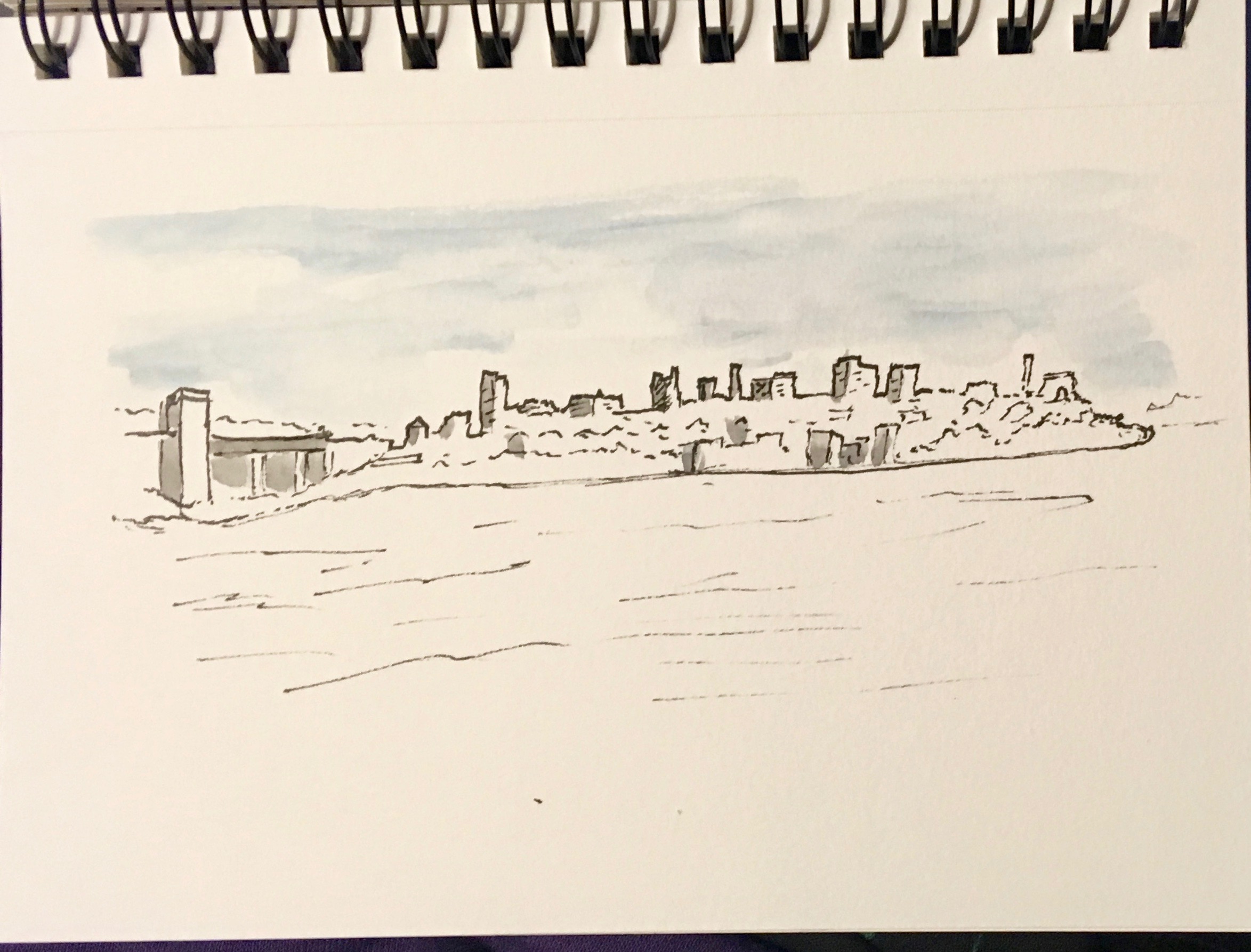
A key concept for travel sketching when trying to capture a distant landscape or cityscape is to first get the skyline right, and make it just a bit more bold.
Thinking back over my years of doing watercolor I remember a time I almost gave it up completely. I was in Sydney, Australia doing seminars, but of course always found time to sketch a bit, and Sydney Harbour has plenty of vistas. This is a photo of Kirribilli Point, at the end of the famous Bridge, just across from the Ferry Terminals.
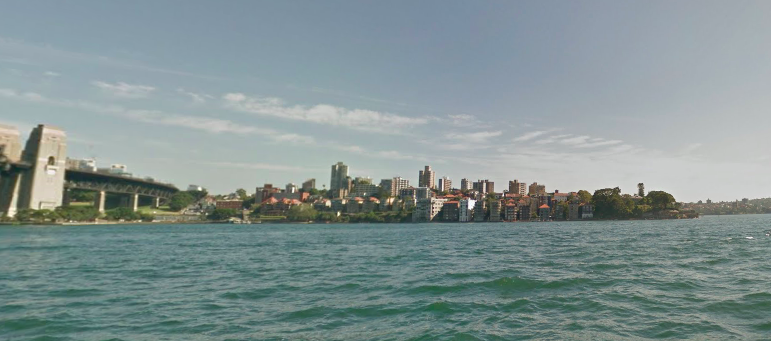
I worked for an hour or so on a watercolor, slightly different angle, but the end result was such a muddy mess that I considered giving up watercolor for good; thankfully I kept at it. Today I did a sketch of the same place to demonstrate a key trevelsketching tip.

Many years ago I learned from an architect to emphasize the skyline by making the lines of the buildings a bit bolder; it defines them for the viewer and helps them stand out. For the travelsketcher it becomes a starting point and prevents getting caught up in unnecessary details. Remember, we are capturing a moment, not trying to create a photographic image. If you get the skyline roughly right, you can be vague on the hillside details, yet the scene will be recognizable. Here is the ink drawing I did using a Duke Confucius Fude pen.

I started by drawing in the skyline, beginning with the pillar of the bridge working my way across the top. You don’t have to be exact, don’t fret if it is not perfect. Next I drew in the water line, and added a few suggestions of the buildings and roofs on the hillside, don’t overdue it. Lastly I did just a hint of hashing in the darker side of a few buildings. After allowing the ink to dry completely I began adding watercolor from my Expiditionary Art-toolkit.
You most always do well to begin with the sky, rarely is it all blue – there are white and grays. I took a light Cerulean Blue, varied the shades, left a bit of white. Never paint it all the same, it is not a coloring book. I also added a bit of gray on the dark sides of the buildings, Ultramarine and Burnt Umber make my favorite gray. Next some darker gray for the skyline buildings and suggesting a few of the buildings on the hilside.
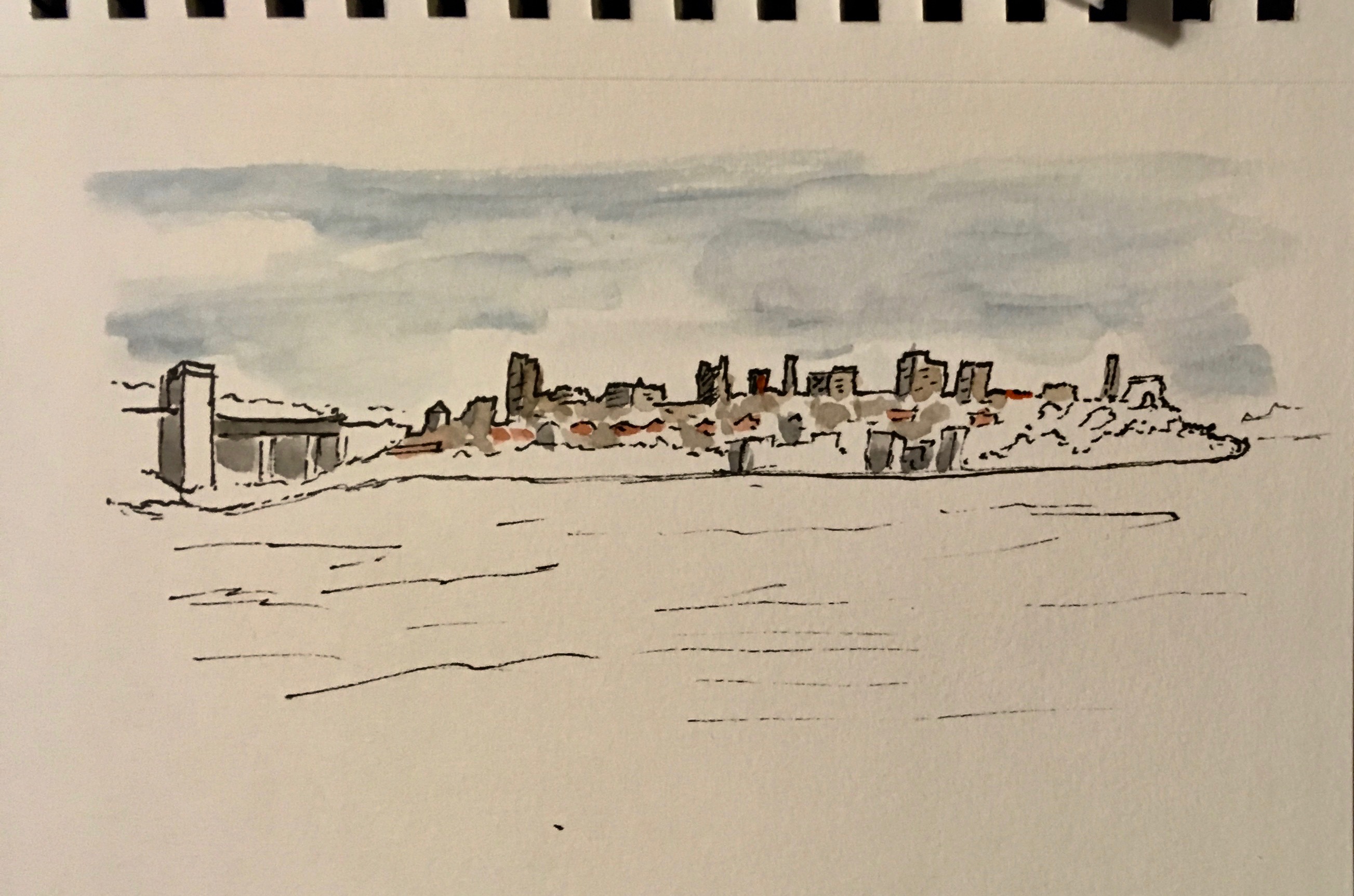
I also used a bit of Cadmium Red to suggest some of the red roofs in the photo. Added the gray under the bridge. Then we are ready for the foliage and a bit more detail.
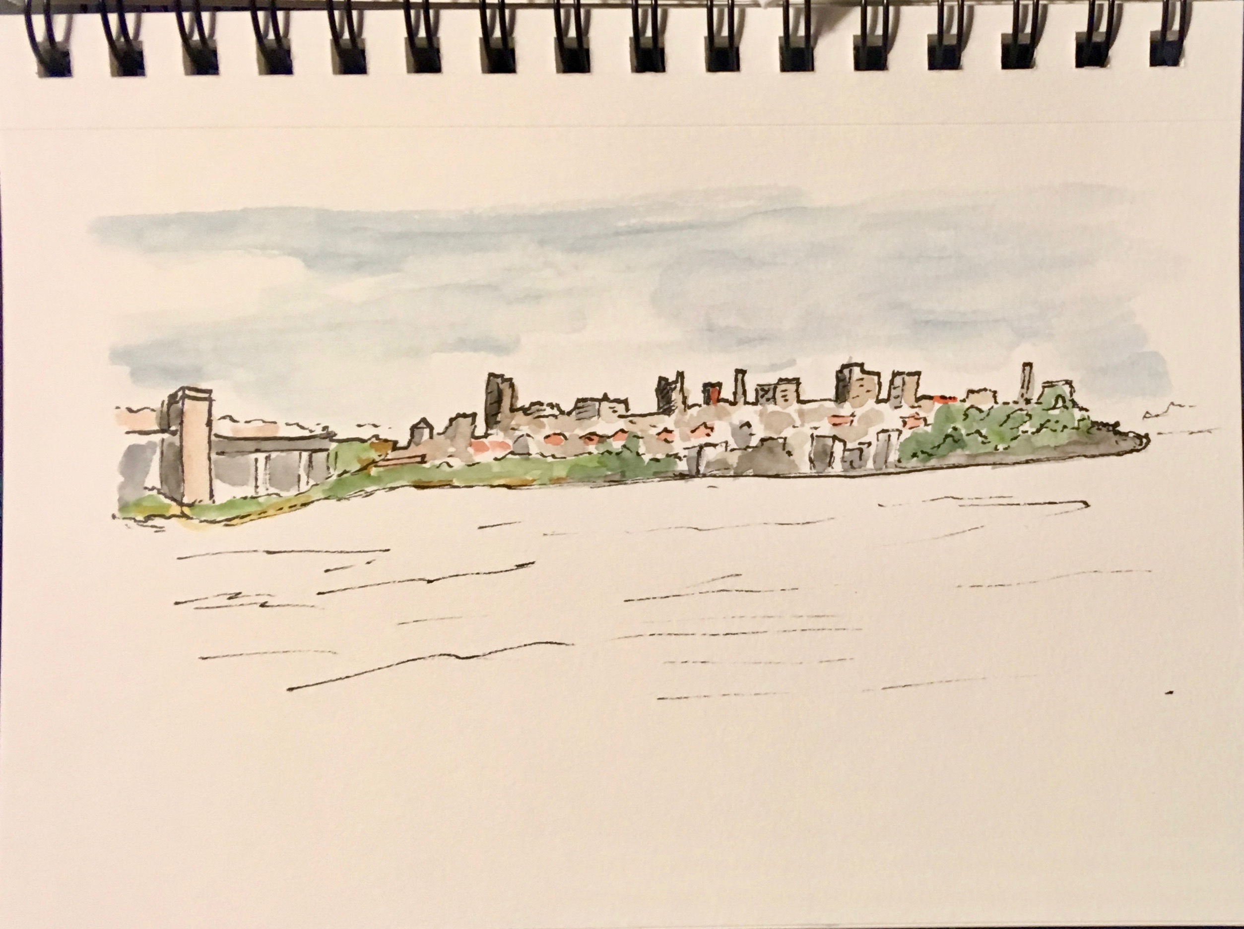
Note that I varied the greens. Sap Green is my go-to green, I added Dark Sap Green to my pallet as it makes adding a darker, or you can mix a bit of ultramarine with the sap green for a bit more gray. I put on one layer of Sap Green, let it dry, then added a bit of darker to vary the folages. All that was left was the water.
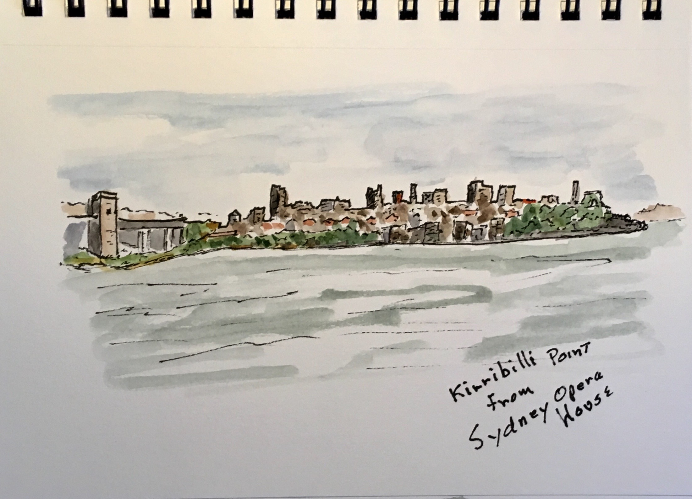
Usually the water will be pretty close to the color of the sky, yet in Sydney Harbour the water is even more green than it shows here. Again, leave some white as it adds highlights. The last step was to use a Micron 01 pen to add some random high lites to the buildings – fountain pens don’t work well over watercolor.
