If you want tons of comments on a FB post just ask, “What is the best…” color, paint, pen, brush, pallet, paper, sketchpad, ink…? A myriad of sketchers will eagerly give you the right advice, while of course clarifying why the comments of others are not the best. However through it all, learning what others do is a good way to pick up ideas. So it is in that spirt that I write today.
My travelsketching pallets were due for a cleanup and reset. So, with the luxury of time while in Le Confinement, I jumped in, and am liking the results, passing it on to add to the body of discussion and confusion on the topic.
When it comes to which colors to include in a pallet there is a bit of theory, a lot of preference, and some logistics involved.
It is pretty tough to paint without at least three colors, some version of red, yellow, blue. Of course it is nigh impossible to get any paint that is just pure color. This of course is where the debates and preferences enter. Often mired in discussions of “warm and cool” colors.
Colors that look like the sun are warm – reds and yellows. Colors that look like water or ice are cool – blues and greens. Oops, first confusion, green is not a primary, you get it by mixing yellow (warm) with blue (cool). Then the theory folks will tell you this means you can have warm greens (more yellowish) or cool greens (more blues). You see where the problems start? In theory all colors tend toward warm or cool, lemon yellow is a warm yellow, Cadmium Yellow is cooler. Are you confused yet? I am.
If you want more on theory, read up on it, just don’t get obsessed by it. Van Gogh was a lover of complimentary colors, Monet did more with harmonious colors. I think both ended up with some pretty good art. Thus I find preference and logistics are more important in my decision making process.
Logistics deal with the simple question of where do you sketch and what do you want to carry. Since I earned the moniker “theTravelsketcher” by spending 25 years sketching while flying all over the world, size was a primary concern. For many, many years I carried the Winsor & Newton Cotman Pocket box, it served me well. It is still the one I recommend to new Travelsketchers at my workshops due to its size, broad mix of colors, and price.
About four years ago I discovered the Art Toolkit, designed by Maria Coryell-Martin of Expeditionary Art. I own three of her palettes and can’t imagine using anything else.
First off a disclaimer – this endorsement is entirely mine, and completely unsolicited from Maria. We follow each other on Instagram, have exchanged a few messages over the years but these are my thoughts that I pass on because when you find something good you want to share it.
Why the devotion to this pallet? Size, design, flexibility. The standard pallet is the size of a business card case, the Demi version even smaller. Yet you can carry up to 28 colors depending on which size of pans you use. Since you fill your own pans the color choice is yours, back to the preference part of the discussion.
So here are my two pallets and their configurations. I am redoing a third one, will write on that one later.
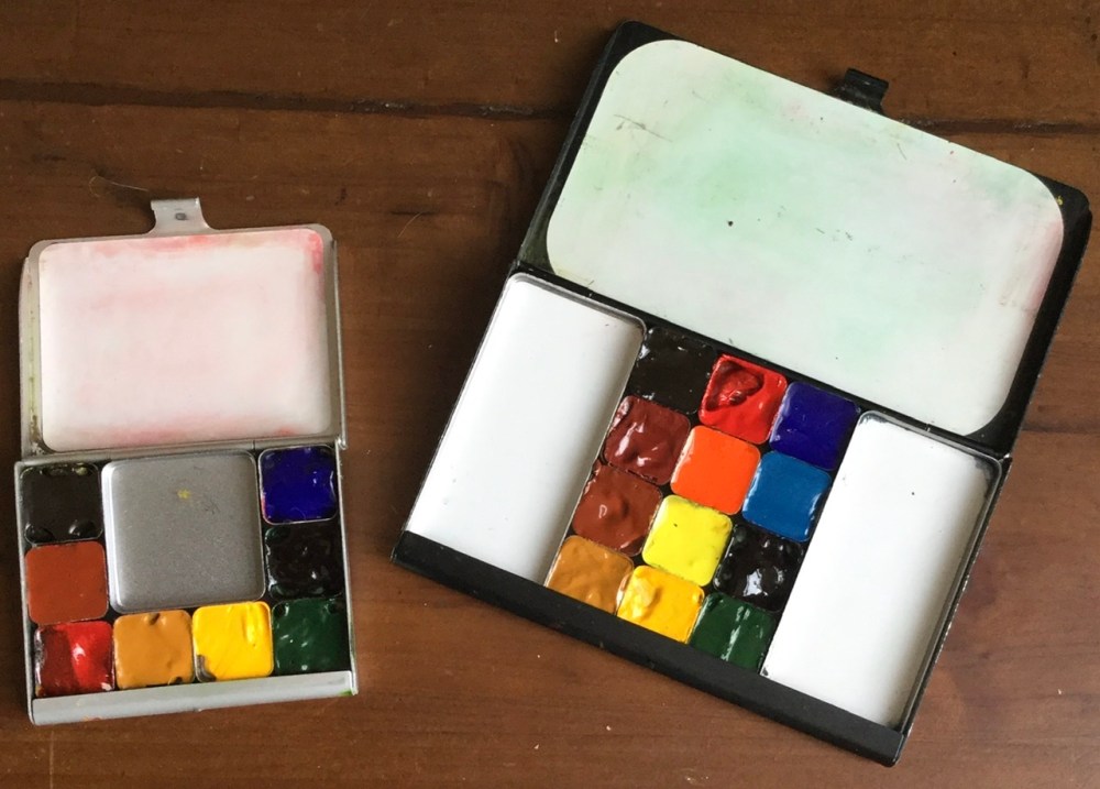
First the small pallet, the Demi. It measures 55mm x 45mm x 7mm. It will fit in the smallest of pockets, thus I am never without my paints.
As far as the colors go, this is loosely a “primary color” pallet. The paint companies love to come out with new colors, they know us artists are attracted to any shiny new object and will part with cash for it. (That is why we all have more pencils, pens, brushes etc. than we will ever use or need.) Over time, like many other artists, I realized that a limited pallet has a lot of advantages, and actually produces better results than trying to carry every possible color.
So here are the colors in my Demi Art Tool Kit – all Daniel Smith brand
- Ultramarine blue
- Perylene green
- Sap green
- Cadmium yellow
- Yellow Ocher
- Pyrrole red
- Burnt Sienna
- Sepia
Here are a few thought behind my selections. Most of what I sketch are either landscapes or urban settings, these colors work well. Ultramarine can go from a light blue for sky, or mixed with sepia makes dark almost black grays. Traveling in Europe I find that yellow ocher works well for castle walls, or highlights in fields, Perylene green works for distant hills. My red choice is not a common one, but I like an intense red for flowers.
The empty square in the center is for additional mixing space.
My full size pallet has two mixing areas and in addition to the colors in my Demi:
- Cerulean blue
- Bismuth Yellow – (Graham not Daniel Smith) I like the intensity
- Pyrrol Orange
- Indian Red (works well for stone and bricks)
I also have another full size pallet that I am redoing with colors for gardens and flowers, more on that to come.
As with so many things in art, there is not one right answer, we are all on a quest to capture a moment. I am sure I will tweak these again in the future, but for now this is just right.
As always, keep travelsketching, even if only from your living room,
